Honest about charities
CBF
If you want to be taken seriously as an inspector of charities you need to be honest and transparant. That’s why we developed an approachable identity and an accessible website where donors can find information easily and quickly. On the site you’ll find information on how your donation is spent and managed by a charity. And how CBF supervises this. That way you can rest assured that your money will end up in the right place.

Accessibility goes beyond UX
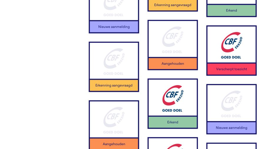
Structuring and cleaning up the information that CBF publishes was the first step towards an accessible website. In addition, we designed a clear and friendly appearance. Frameworks for measuring whether a charity is doing the right thing formed the basis for the identity. The solid blocks are framed with dark blue lines, emphasising the role of CBF as a yardstick as well as giving the brand a striking personality.


The tasks that CBF is working on are usually behind the scenes and quite abstract. Easier to express in words than images. But words don't say everything. Which is why we clarify the content with colorful, simple icons to give visitors a more concrete idea of the work the CBF does, through stories from CBF employees.

Each charity organisation needs to conform to strict requirements if it wants to be labeled as CBF approved. To assist charities with a smooth sign-up and the handeling of the necessary tests, we designed the MyCBF environment next to the informative website. This way charities can always view and manage their information.